Component hierarchy
You already saw the FullFileBrowser component on the Installation &
usage page:
import { FullFileBrowser } from 'chonky';export const MyFileBrowser = () => {const files = [];return <FullFileBrowser files={files} />;};
FullFileBrowser is actually just a convenient shorthand to the code shown below. It is
a good idea to use FullFileBrowser if you want all Chonky's features. Plus, using it
means new components Chonky introduces will be automatically enabled in your app!
import {FileBrowser,FileContextMenu,FileList,FileNavbar,FileToolbar,} from 'chonky';export const MyFileBrowser = () => {const files = [];return (<FileBrowser files={files}><FileNavbar /><FileToolbar /><FileList /><FileContextMenu /></FileBrowser>);};
However, there are situations where you might want to disable some Chonky components, e.g. if you want to provide your own context menu.
The only required component is FileBrowser, which should appear on top level. All
other components are optional - for example, if you just want to show a list of files,
without toolbars or navigation, you would use:
<FileBrowser files={[]}><FileList /></FileBrowser>
Power users might also want to provide their own implementations of different
components. For example, someone could make a custom MyToolbar component by cloning
Chonky's FileToolbar:
<FileBrowser files={[]}><MyToolbar /><FileList /></FileBrowser>
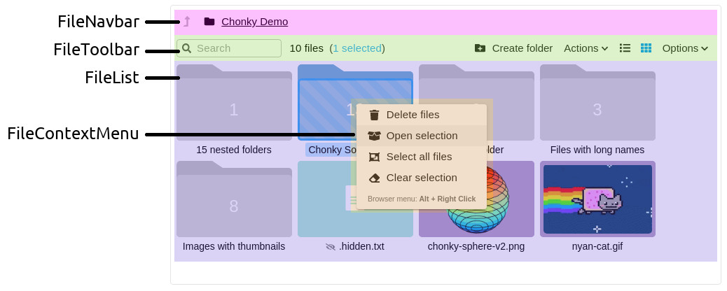
Component breakdown
FileBrowser- the top level component. It provides several React contexts for its children, including Redux store and JSS theme.FileNavbar- navigation component. It shows the path to the current folder.FileToolbar- main controls component. It contains a search bar and file action buttons.FileList- file list component (duh). It shows files to users and lets them make selection or drag & drop things.FileContextMenu- menu component. It provides the right-click menu with file actions.